Chinatown Meets Victorian Glamour At London's Duck & Rice
Welcome to Interior Motives, our recurring feature focusing on the design inspiration behind just-opened restaurants, food halls and bars.
Chinese food gets a bad rap in London. That's not to say that anyone doubts its deliciousness. Only the most hardened Londoner could fail to love a perfect char siu bao. Rather, it often feels relegated to the cheap and cheerful option, consumed in a hurry or used for soaking up a boozy night on the tiles.
It's with this in mind that local restaurateur Alan Yau set out to reshape outdated notions of the cuisine of his beloved Hong Kong. Having set the ball rolling with glossy, Michelin-starred offerings like Yauatcha and Hakkasan that changed London's dining landscape, this time he's turned to the humble café dishes that dot the city's Chinatown for inspiration.
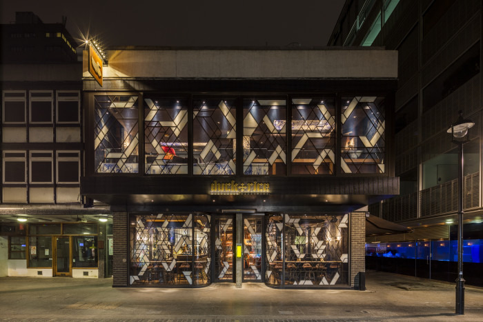
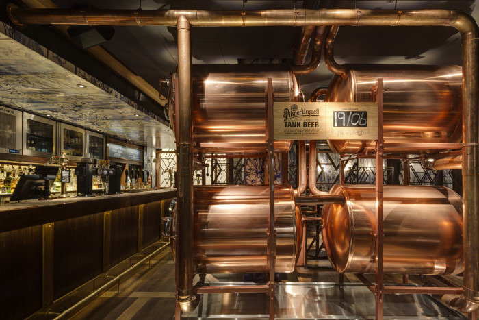
Yau tasked Istanbul-based design studio Autoban with working their magic on the dark, stuffy space that used to house the affectionately remembered Endurance Pub in Soho. The results have been nothing less than astonishing — abstract geometric patterns etched on a glass facade greet guests at the entrance, and four massive, glowing copper beer tanks dispense beautiful, unpasteurized Pilsner Urquell, a nod to the British propensity for consuming beer with noodles and a tribute to the site's heritage.

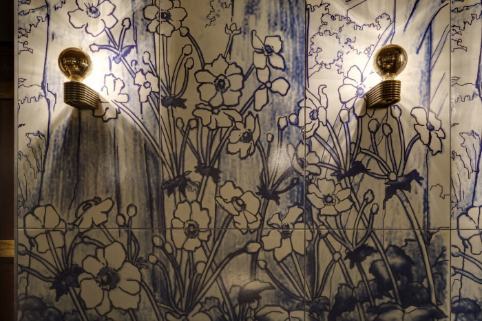
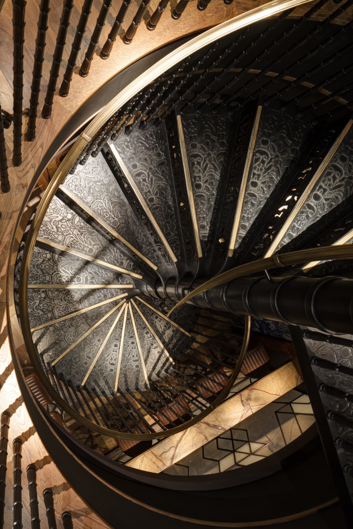
Inside, oversized white tiles with striking blue floral motifs cover the walls, paying tribute to Rang Dynasty–era porcelain glazes. Meanwhile, a dramatic cast-iron staircase leads diners from the downstairs pub to the upstairs dining room, where rotating lazy Susans form centerpieces for the numerous banquettes that wrap around richly veined marble tabletops.
The food's no slouch, either. Aside from luxurious interpretations of Cantonese classics like roast duck (rich, with the perfect amount of fattiness) and jasmine-smoked pork ribs, the kitchen turns out beautifully executed British-Cantonese staples in a playfully tongue-in-cheek reference to Londoners' love of good takeaway. Thus, precision-fried salt and pepper squid comes with a crisp, light batter and subtle heat from chilies, while stir-fried beef is a simple, addictive pleasure, the crunch of vibrant scallions contrasting with the glorious chew of tender bavette steak.
Here, we talked to Autoban's Seyhan Ozdemir about the team's design process:

What was the initial concept for the design of the space?
At Duck & Rice, our brief was very clear right from the beginning. This was going to be a British pub based in London with a Chinese kitchen. Alan Yau has this unique ability to see cultural metaphors in a lot of things, and he sees restaurants as film directing. That's very similar to our approach in design — we create scenes while thinking about every single detail, pretty much like a film director. So here, we blended British and Chinese metaphors using our layered approach. One of these layers is made of wood, representing the traditional Victorian pubs, and the other layer is the handmade, oversized white tiles with striking blue floral motifs that cover the walls and are repeated in sections of the ceiling.
Who led the design and construction?
The Autoban team led the design, while the construction was led by local architects Archer Humphryes Architects and our main contractor, Misia & Carter Shopfittings.
What were the biggest challenges, and did any compromises have to be made?
We had to be really careful with the space available. Every single centimeter counted. And because both [collaborators] are profound detailers, there was a great deal of problem solving — it went on to be a project where we designed every single centimeter. Also, restaurants are commercial spaces, and they have to make money. So at Duck & Rice, we made some compromises to make room for maximum seating.

What's the most interesting design detail in the space, and how do you feel about the outcome?
For me, it would be the layering that represents the British and Chinese aspects of the space. The most striking design detail would be the oversized white tiles with striking blue floral motifs that cover the walls and are repeated in sections of the ceiling. We are very content with the result — this was a fruitful collaboration for us and [Yau], and we got a lot of good feedback from the customers, too.
How do you feel the design works with the menu and food?
The restaurant serves Chinese comfort food at a British pub. As with Alan Yau's approach to the menu, our design concept for the eatery was inspired by traditional pub design, and the materials that we used within the space showcase Chinese influences in an overall contemporary setting.

The Endurance Pub was a Soho landmark for many. Did that affect the design and construction process?
We can't say it affected the design directly, but of course knowing that there was already an established culture here was something that inspired and encouraged us. We brought in a new offering to the same location.
Alan Yau is known for his distinctive, striking restaurant interiors. Did that add additional pressure to design a standout space, and how do you feel Duck & Rice fits in with his previous restaurants?
We didn't feel any pressure at all. On the contrary, we believe Alan Yau's attention to detail at his restaurants was the reason he chose to work with us, because we're quite detail-driven, too. He's also a fan of natural materials like us. What we added to that at Duck + Rice was craftsmanship, highlighted by the materials, finishes and detailing.

