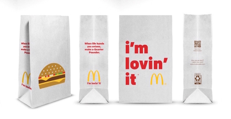
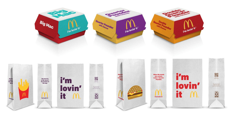
McDonald's Just Rolled Out Subtler Packaging. Has Anyone Noticed?
With new year's resolutions in full effect, is this the right time for a fast-food chain to introduce a new branding concept — and expect anyone to notice, that is? Or maybe that's the point in the case of McDonalds' recent debut of new packaging designs, created in collaboration with the Leo Burnett agency.
Given what we've seen so far, it seems like the brand is stripping down its identity in favor of a more subtle, even generic look. Perhaps the subtlety will mean less backlash, which the brand is also countering with the introduction of the enhanced catchphrase, "Lovin' Is Greater Than Hatin,'" to interchange with its longtime tagline "I'm Lovin' It."
Undoubtedly, after reporting a 30% drop in quarterly revenues last fall and fast food facing a growing backlash, McDonald's is already feeling bruised, but we're not sure if new packaging is really going to offer a substantial boost. As they say, "Haters gonna hate..."
 Some of the more obvious changes to the packaging feature generic, minimalist burger illustrations and the brand's signature tagline. [/caption]

More graphic design on Food Republic:

