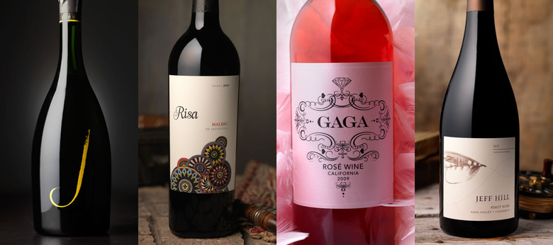
How To Design A Best-Selling Wine Label
We at Food Republic like to dole out advice on what to drink when it comes to wine. That's all well and good, but we know how it is — when you're out there on the front lines, standing before 100 bottles on the shelf at the wine shop, you're going to buy what jumps at you. And, for better or worse, that often has less to do with what's in the bottle and more to do with what's on it. Wine label designer David Shuemann is banking on this fact. His firm CF Napa has designed labels for dozens of well-known and small-batch brands. He just released a book of his favorites, 99 Bottles of Wine, and reveals to us just what draws people's eye to a bottle and why certain labels simply turn us off.
When a winery comes to you to design or redesign a label, what are they usually after?
A lot of the time, we're asked to help make the wines look more expensive or more premium, so when they're on the shelf next to competitors they simply look more expensive. Humans really do eat with their eyes and it's the same with wine. If you imagine a wonderfully prepared meal that's thrown onto a plate very sloppily. It's just not going to have the same kind of effect as something that's beautifully plated.
What are some of the worst labels you've come across?
Labels that become a barrier to sale. They're either just plain ugly or they don't evoke a proper sense of quality for the price point of a wine. Functionality of the label is often an issue, as well. We call it "bad hierarchy." As in: the brand name is hard to scan for on the shelf, or the label doesn't do a good job of communicating the varietal. People will just look past it if it's not clear.
What are some trends in wine labeling these days?
Traditionally, wine labels were very much influenced by European countries like France, where they tend to have a much more conservative look and feel. Nowadays, the U.S. is leading the charge in very colorful and non-traditional wine labels. Things like embossing and really juicy textures, almost like a wedding invitation, are tactical and look high quality. Plus, labels can be made out of anything these days. Cork, cloth, silkscreen, metal – like Smith & Hook, which is in the book – and even custom-molded glass bottles are replacing traditional paper wine labels.
Are there any colors that should never be found on a wine label?
Probably, like forest green. You'll often see reds or deep jewel tones on red wines and you'll tend to see fresher colors like yellows, oranges and apple greens on white wines. Those are there for a very specific reason: to reinforce the different flavor cues consumers have come to expect from those wines. There's also a trend to break those rules by using color in a way that just becomes disruptive. We created a brand a few years back called Line 39 that uses a turquoise evocative of Tiffany blue. It ties back subconsciously to Tiffany's and diamonds – and it's been wildly successful.
What are some of your favorite labels you've worked on?
From a sheer challenge standpoint, there was this really small boutique brand called Scarlet. It was a small-production Napa Valley wine. They wanted to have their label named after their daughter, whose name was Scarlet. They even wanted to incorporate the little girl into the label somehow, but she was a minor at the time. So, that proved to have legal issues. We ended up designing a label that uses imagery of a young woman with her hair flowing, more like this goddess of the vineyard, like the little girl all grown up. It's really visually arresting. I'm proud of that one.
Have you ever bought a wine with a great label that turned out to be terrible?
You'd think I'd be more savvy, but I have definitely fallen prey to that. Like everyone, I do on occasion take a chance on something I'm not familiar with. I've had my share of wines that weren't as good as I thought they'd be based on the label. Hey, kudos to the designer.

