Are These New Square Wine Bottles Messing With Success?
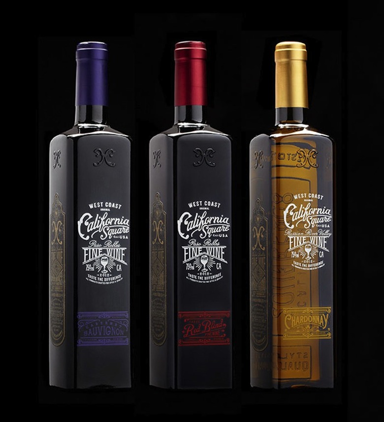
Head's up, wine purists! The wine bottle as you know it might soon be going square. Blasphemous as it may seem to tinker with something so timeless, these modern times call for functionality that trumps tradition. There was also a time, not so long ago, when wine drinkers pooh-poohed the idea of non-cork stoppers and twist-off caps, but those innovations are now practically status quo. At least in the case of these stylish new square bottle designs by Stranger & Stranger for Truett-Hurst wineries, this newly proposed shape is an easy one to warm up to.
According to the New York– and London-based design firm (they're also behind the cool label designs for Compass Box Whisky), there's an easy, logical reason for getting behind square bottles: quite simply, they take up less space. "If the wine industry turned over to square instead of round bottles, we'd save almost a million trees in outer cardboard boxes alone, not to mention savings in shipping and storage," they explain. And just think about how many more bottles you'd be able to stack and store at home without the need of a wine rack.
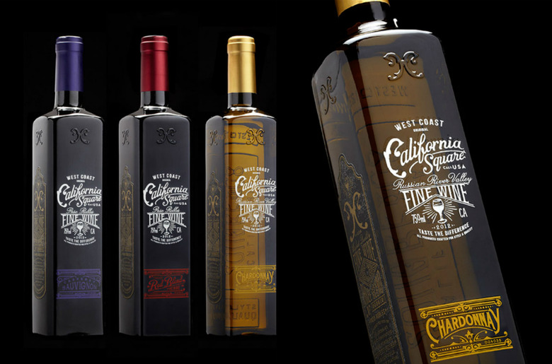
As if that's not incentive enough, Stranger & Stranger's embossed glass bottles and vintage-inspired typography for the new California Square line of wines makes for an even more compelling design. Check them out below.
 Times are changing: Stranger & Stranger's new bottle designs for California Square marry functionality (they're major space-savers) and style, rendering the concept of going square an easy one.[/caption]

More Design on Food Republic:

