Food Pyramids Of The World
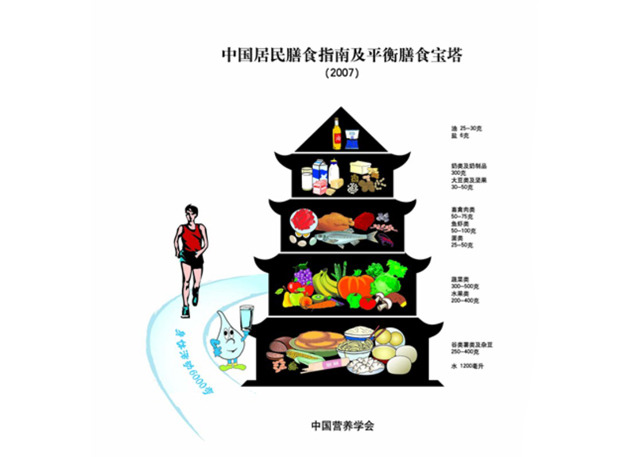
The US Food Pyramid may be dead, but many countries around the world still look to the pyramid to convey nutritional advice for its citizens. Americans now can get used to the new MyPlate design — which is similar to Spain, Australia and Britain's, by the way — but in China, Poland, and elsewhere, we've found some creativity.
We also found a lot of similarities between the ways countries tell their citizens to eat — and some differences. While most of the guidelines propose a similar ratio of proteins, grains, fruits, vegetables, and dairy to the U.S.'s MyPlate, some contain regionally specific advice. It is clear that dietary images worldwide struggle to strike a balance between comprehensive but chaotic information (see Germany's 3D pyramid) and simple design with few specifics (see Hungary's house).
Here on Food Republic, co-founder Marcus Samuelsson noted last week that the rest of the world looks to the US as a leader, so we'll see if other countries jettison the pyramid for the plate. In the meantime, here's a look at 10 of the most visually stimulating food guideline charts from around the world.


