This Is What Food Labels Should Look Like
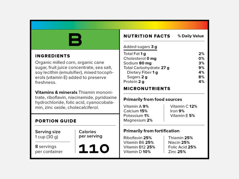
Earlier this year, the U.S. Food and Drug Administration updated its requirements for the nutritional facts label on packaged foods. Most notably, the new label finally makes a distinction between naturally occurring sugar in things like fruit and the common "added sugar" that is often blamed for making us all fat.
While nutritionists have applauded this overdue regulatory change, there is still a lot of room for improvement. What will those future tweaks look like? Well, the editors at Wired have some ideas.
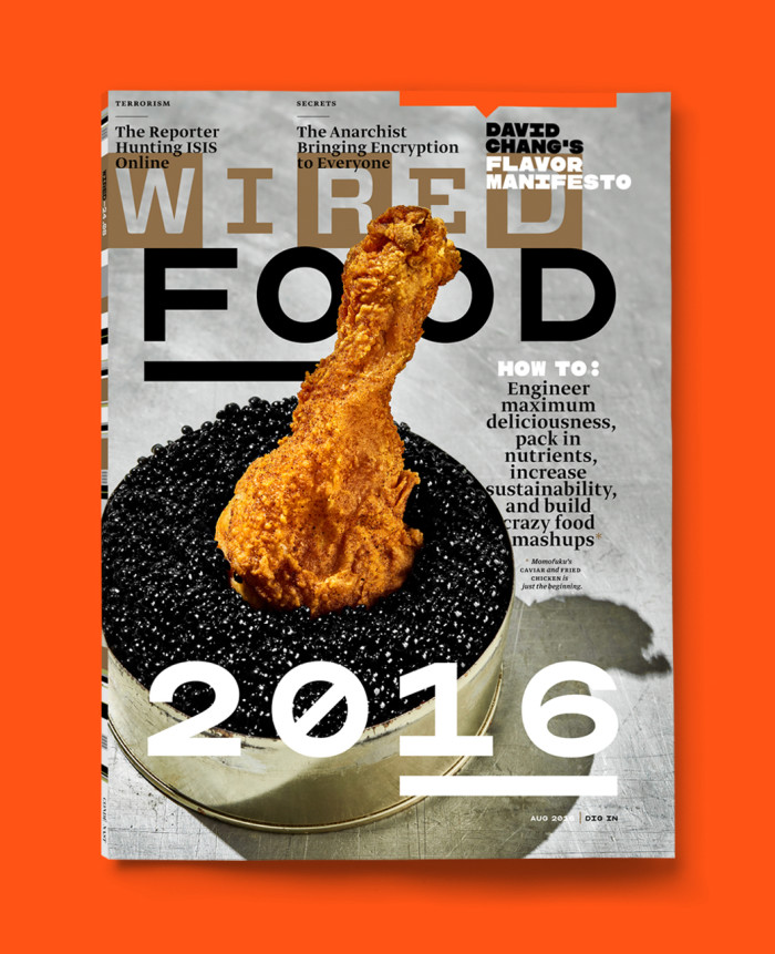
The magazine's latest issue — which is largely dedicated to food (including a tantalizing cover shot of a fried chicken leg dipped in caviar) — features a wholly reimagined label created with expert input from nutritionist Marion Nestle and toxicologist Alan Goldberg.
Highlights include a traffic-light-style color-coded warning system (a sort of health-conscious spin on the U.S. Department of Homeland Security's terror-alert chart) and also a nutritional letter grade (not unlike the New York City Health Department's method for rating the cleanliness of restaurants). Ingredients, meanwhile, have been relocated to improve visibility, and the label also spotlights long-unlisted nutrients like magnesium and vitamin E.
Pick up a copy of the mag to check out the full range of suggested improvements. Then try to guess how long it takes for the federal government to act on any of them.