Alsatian Roots Intertwine With New York City Vibes At Gabriel Kreuther's New Midtown Spot
Welcome to Interior Motives, our recurring feature focusing on the design inspiration behind just-opened restaurants, food halls and bars.
When Gabriel Kreuther, longtime executive chef of the Modern, stepped down to open a restaurant of his own, New Yorkers wondered what turn the Frenchman's post–Danny Meyer life would take. A rather blissful one, it turns out. Housed on the ground floor of the Grace Building, that striking convex skyscraper across the street from Bryant Park, is his eponymous restaurant. Patrons can either ensconce themselves in the swank dining room for Colorado lamb with hay jus or opt for the more chill bar/lounge for at least one addictive, smoky tarte flambée before calling it a night.
Both of these distinctive spaces are interconnected, weaving together sophisticated design elements like a curved platinum ceiling and green tiles that evoke the wood-fired ovens of Kreuther's native Alsace. This sophisticated look was conjured by local architecture and design firm Glen & Company, which also left an imprint on such radiant spaces as Carbone and Bâtard. Here, the firm's founder, Glen Coben, discusses how Kreuther's Alsace-meets-New York biography provided the inspiration for this midtown newcomer.
How did you and Gabriel first meet?
We were introduced via his partner, Eben Dorros. He reached out to us and we scheduled a meeting. I asked if I could spend some time with Gabriel and tour the site with him. It was probably October of 2013, and after we did a walk-through we grabbed a cup of coffee at Le Pain Quotidien on the other side of Bryant Park and had this fantastic conversation for two hours. He asked questions about our philosophy, and we asked him about the dishes that best reflected his.
How did that dialogue spawn your initial design vision?
Gabriel talked a lot about his Alsatian roots, but also New York. It became a very clear message that he wanted to do something rooted in his past but that also showed how he evolved as a chef from his home to here. A couple of weeks later Gabriel and Eben came into the office and we made a presentation, partially about our qualifications and how we would solve problems, but also how we would interpret Alsatian architecture and design through a modern lens. We set up a board, which culled images of Alsace and different fabrics and textures that together signified the evolution of Gabriel Kreuther.

Was there one unifying feature that guided this narrative?
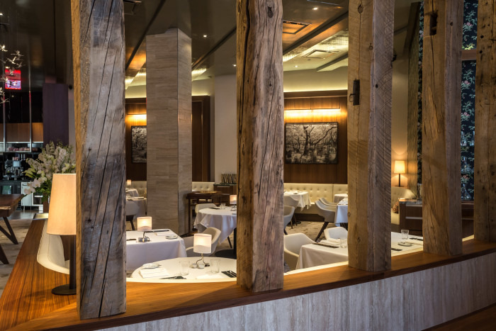
We essentially created a zone called the town square, which you would find in Alsace. It's the heart of the space, but it establishes different feels within. One edge of the town square is defined by reclaimed beams, our modern depiction of the "stick-style" Alsatian architecture known for exposed rafters. We arranged these posts in a big, sweeping curve 14 inches apart from one another, offering a sense of enclosure to the dining room. The other edge of the town square is marked by the banquettes, with glass globe lights hanging overhead to symbolize Alsatian street lamps. We used elements of the restaurant to form edges of spaces, but they are not barriers; they allow for visibility and transparency.
"Transparency" is a word you also use to describe Gabriel's food, so the design clearly complements that.
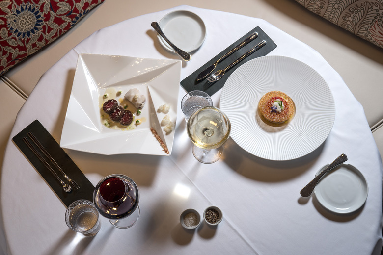
It's a big word for us — both in terms of our design and Gabriel's cooking. For example, there's one dish he makes, a tart with sauerkraut and sturgeon, that's just beautiful in its simplicity. The success of the restaurant's design is not only about uncovering Gabriel's Alsatian roots on his journey to New York, but interpreting the layers of his cuisine.

The subtle use of symbols is one way you've achieved this. The storks are a recurring motif. Why?
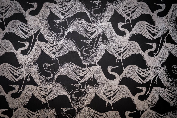
It's the Alsatian symbol of rebirth. We spent a lot of time trying to find appropriate stork images, and we didn't want to over-stork the restaurant, so it manifests three times; it's not a magic number, but we felt it would be excessive beyond that. The first time is in the entrance vestibule. We weren't allowed to do anything to the exterior, so the entry was even more important because it's the first thing you see. We blew up this stork pattern onto the glass wall on a big scale, and what's cool about it is it's kind of acting as a step and repeat on images we see on Instagram now. The pattern then repeats itself in a wallcovering further back at the edge of town square, and the third one is probably the neatest: a chandelier with 42 crystal storks hanging from it.
Is there one material you used that you are particularly drawn to?
The reclaimed barn timbers. Sometimes they are referred to as beams, but technically they are timbers from a barn built in the 1880s in Vermont. There was no significance to the barn; it just no longer had a use and was torn down. Eben and I went to Lake George and we picked out the beams. They are beautiful, peaceful and modern. Aligned vertically, they screen the dining room and feel like the spirit of an Alsatian village.
What was one of the challenging elements for which you came up with a creative solution?
There were three elements we had a hard time with: the chandelier; the carpet, which ended up being a custom design that my office created based upon an Alsatian textile pattern; and the bar stool. We designed it from the bottom up, and after spending time with Gabriel and his staff, we knew how big the seat and how high the footrest needed to be. What it should look like was becoming more challenging, however. Then one night Gabriel and I had dinner at Bâtard to try and resolve some of these open design issues. I sketched out what became the bar stool, and I remember Gabriel loved it and Drew [Nieporent] walked over and said, "Oh, a modern interpretation of the Alsatian symbol for hospitality." It's a heart, the Alsatian version of the pineapple. You'll find it on shutters there and on the backs of chairs in old bistros. The true moment of clarity is when the bar stools arrived and Emilie, the sommelier, had the biggest smile on her face. She was in the middle of a staff training and said, "This, my friends, is the way Gabriel Kreuther is saying, 'Welcome to my restaurant.'"
Gabriel Kreuther
41 W 42nd St.
New York, NY 10036
212-257-5826

