This Is What Happens When A Pastry Chef Gets Mixed Up With A Graphic Designer

When pastry chef Benoit Castel decided to offer three newly-formulated riffs on tiramisu at his Paris-based patisserie LIBERTÉ, creating a visual concept to match the classic Italian dessert's updates was equally quintessential. Looking beyond the kitchen, Castel enlisted the aid of a graphic designer — not for the packaging and branding, but for the pastry itself.
The result is a typographer's dream take on tiramisu, literally spelled out...only the final product reads as TYRSAMISU, a namecheck to Castel's collaborator, the French graphic designer Alexis Taieb, also known as Tyrsa. "I wanted a rich enough effect to refer to the work of lead letters used in historical impression, which is why every type is different," Tyrsa explains of his individually hand-drawn letters.
Having previously worked together on the packaging for a chocolate bar Castel created, the pair reunited on this particular pastry scheme about a year ago after Castel opened his own shop in Paris' Canal St. Martin neighborhood. Although they don't have anything planned just yet, we'd love to see Castel's and Tyrsa's take on the time-honored eclair.
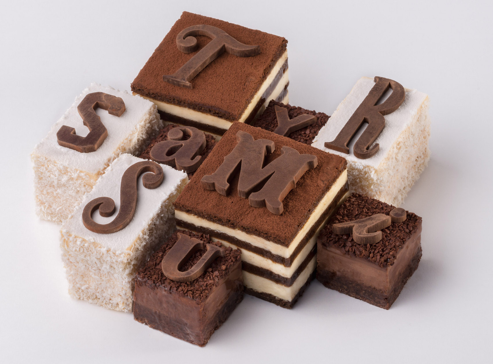 Crowning glory: "Tyrsamisu" won't look like any other tiramisu you'll find in Paris. The special-edition pastry is available at LIBERTÉ through early 2015 in single serving portions (just the letter T) or as a fully-spelled set (serves 6-8).[/caption]

More French design on Food Republic: