Meet Morimoto's Restaurant Designer
"We're almost like Siamese twins," designer Thomas Schoos tells us about his creative symbiosis with Masaharu Morimoto. Having closely collaborated with the celebrated chef on four of his restaurants now, the German-born, LA-based designer certainly has a claim.
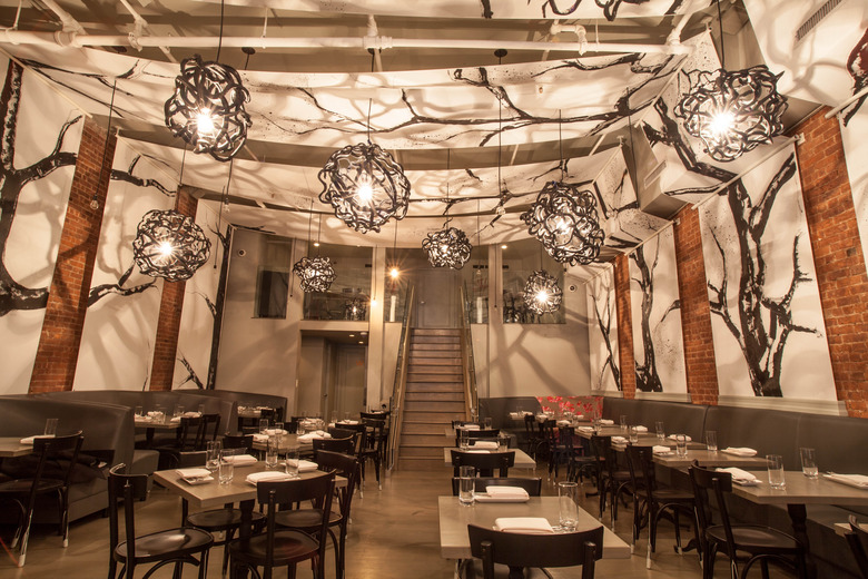
While Schoos pointed out that each Morimoto restaurant design varies, their most recent project, Tribeca Canvas in downtown New York City, is an especially noted departure — and not just with regards to décor, but also its menu featuring Morimoto's take on Western comfort food (think lamb ragu buns, hamachi tacos and other playful interpretations such as "Duck Duck Cous."). To keep the relatively small 80-seat dining room as spacious-feeling as possible, Schoos and Morimoto stripped the whole joint down and hung loose canvases along the ceiling and down the walls — with Schoos playing the painter. Read on for more about the design and where Schoos loves to eat on both coasts.
Tribeca Canvas has been described by its owners as an "art-restaurant." What does that mean?
Well, Tribeca is, among other things, a center for art, art galleries and artist studios. And when Morimoto and myself got together, we thought, you know, we should treat it as a gallery — as an art space. And food is art, especially when you think about how Morimoto plates his food. But also at one point, many years ago, Tribeca was also very green — mostly farms. So I took huge canvases and I painted black trees in the style of Japanese calligraphy art. We wrapped the whole restaurant inside a canvas of art. And so I chose to go with very simple black and white tones to let the food be the focus.
What were some design challenges you came up against with this space?
It was a very odd space — very innovatively ugly before we began construction, I have to say. We ripped it down to a square box. It's not a big space. It's a narrow space that doesn't allow you to do a lot with it. It was also for us a chance to be creative and show that the menu is different from Morimoto's higher-end restaurants. Same with the space. It had to be cohesive.
Being based in LA, how did you negotiate working on a project in New York?
I flew back and forth. I fly like 400,000 miles a year, so for me to go back and forth, up and down, it's nothing. I love New York. It's a great place to be. I painted the pieces [in LA], then they got shipped to New York, and I installed them over there with a group of people.
What are some of your favorite places to eat in NYC?
I actually love Chinatown. Any crevice in Chinatown sucks me in. The noodle houses at 3 o'clock in the morning — the best thing there is. Also, I do love Eataly. I do my shopping there, and I have lunches there. I like the Ace Hotel, and the restaurant downstairs with the suckling pig on the menu — The Breslin. LOVE IT. I remember the first time I walked in there, I loved the bar and the feel of the hotel. I walked in there, and there was a table of 14 girls, all dressed up to the nines, eating suckling pig. I was like, "YES!"
As a designer who's worked on projects on both coasts, would you say there's a notable difference between the LA and NYC dining scenes?
If you had asked me five years ago, that question would have been easier to answer, but now, I think they come out pretty equal. In New York, I feel like you still don't have as many health restrictions. What I always enjoyed in New York was that old pub, that easy diner. LA was always more polished...more Hollywood, more put-together. But finally that's changing. I go to a place called The Village Idiot in LA, and to me that's like going to New York.
Where else do you like to go 0ut in LA?
I also like Animal — and those same people opened Son of a Gun. There's a place on Santa Monica Boulevard that's called Laurel Hardware. They have amazing, fantastic flatbreads, pizzas, shredded pork, beef and mustard sauce, fresh-grain breads, and pretty girls...young people who lounge in the back with the olive trees. It's very eclectic.
As far as restaurant design trends go, what do you expect for the future?
The next movement, I think, is to be interesting again. I think art and dining is finally coming together again in a new way — not in a flashy way, but I think art installations in restaurants will be the next thing to come through.
Read more about restaurant design on Food Republic:
- NYC: New Restaurant Willow Road Travels Back To Its Nabisco Roots
- A Freelancer's Coffeeshop Haven Opens In Paris
- Coney Island's Boardwalk, Re-Materialized At Prospect in Brooklyn
 Tribeca Canvas' main dining room: Making use of his background as an artist, Schoos hand-painted the canvases himself.[/caption]
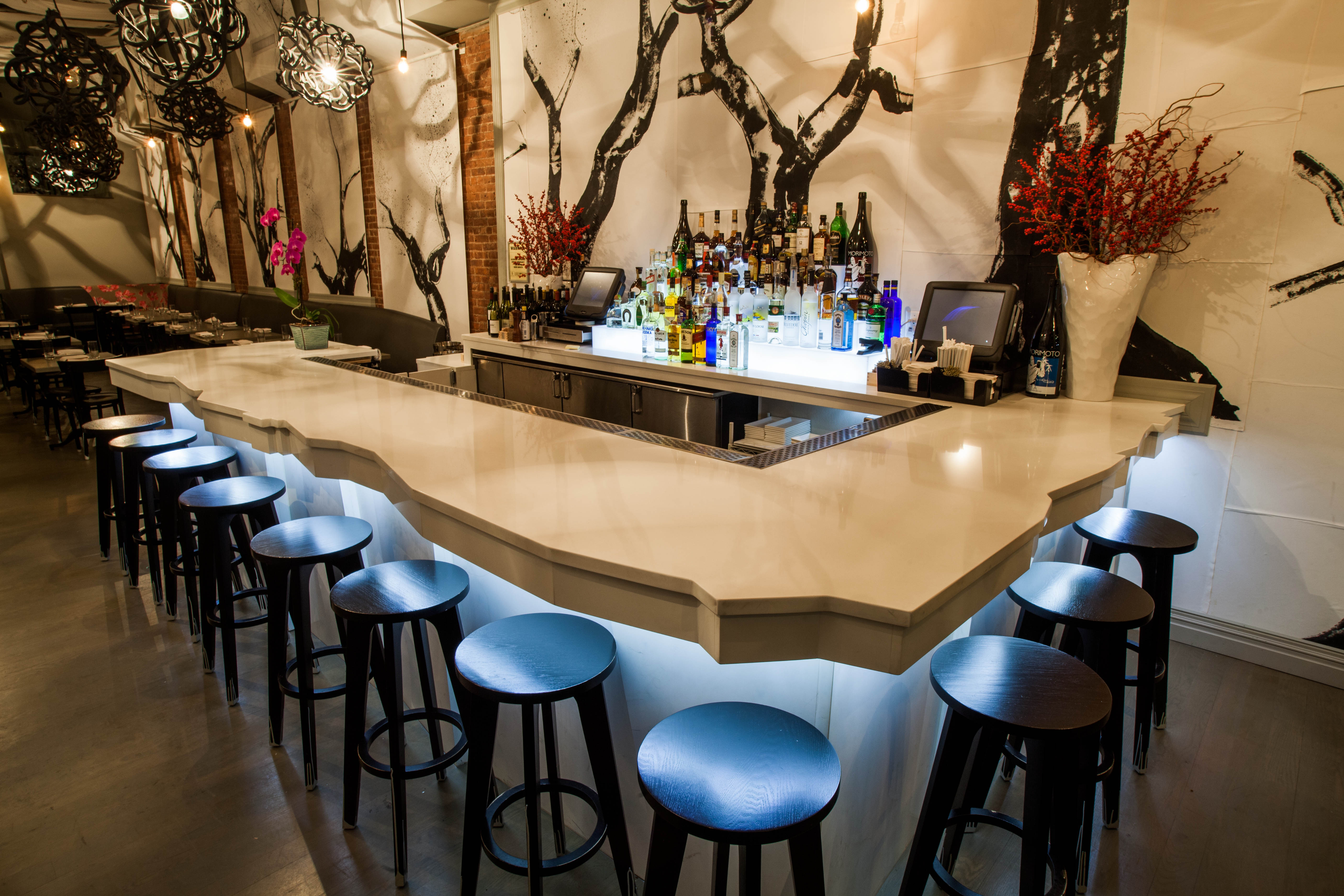 With the exception of cool blue underlights, the otherwise bare bare keeps with the theme of style through simplicity.[/caption]
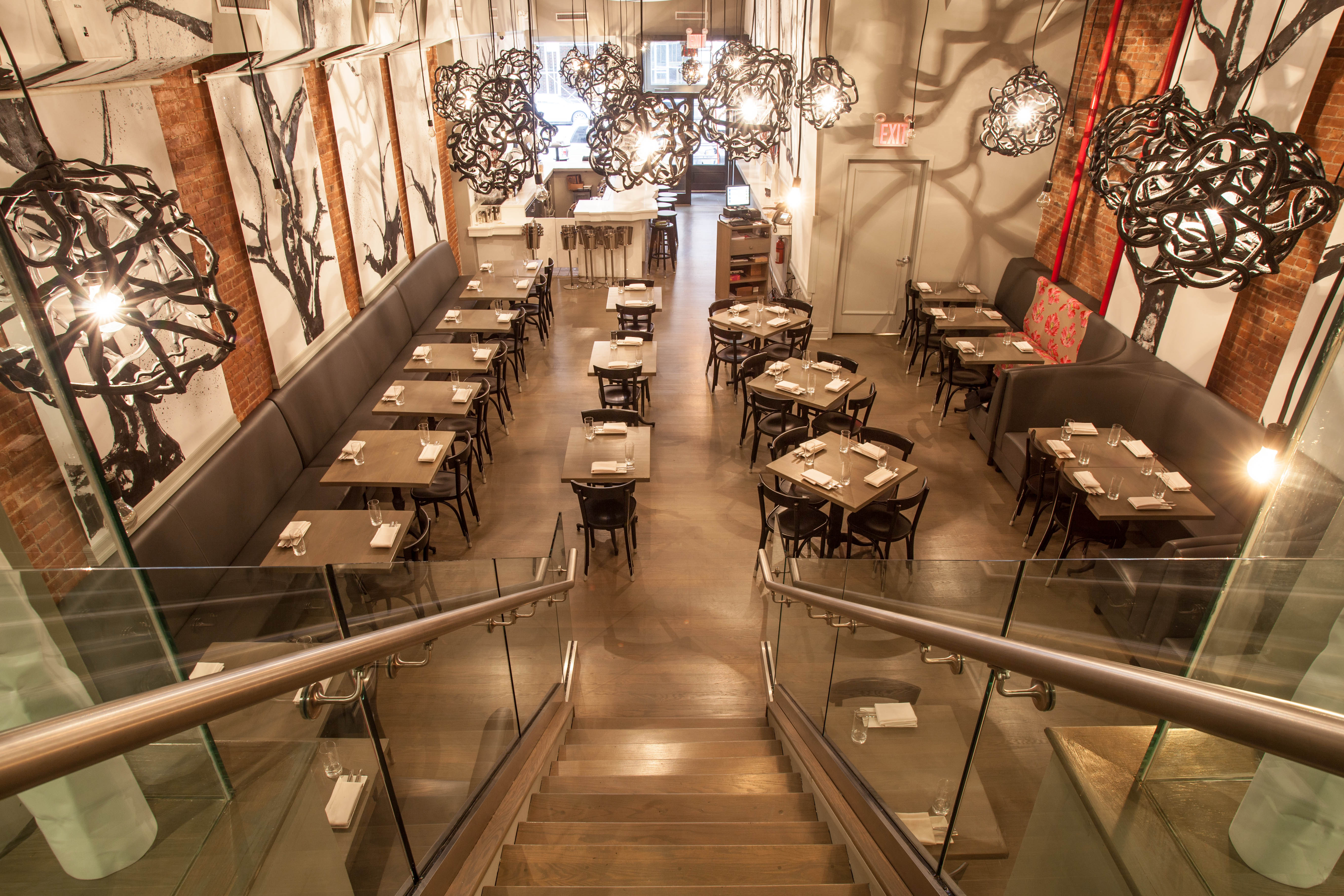 "It's not a big space. It's a narrow space that doesn't allow you to do a lot with it," said Schoos. To overcome the issue of limited-square footage, Schoos and Morimoto kept the decor relatively stripped down and airy-feeling—much like an art gallery.[/caption]
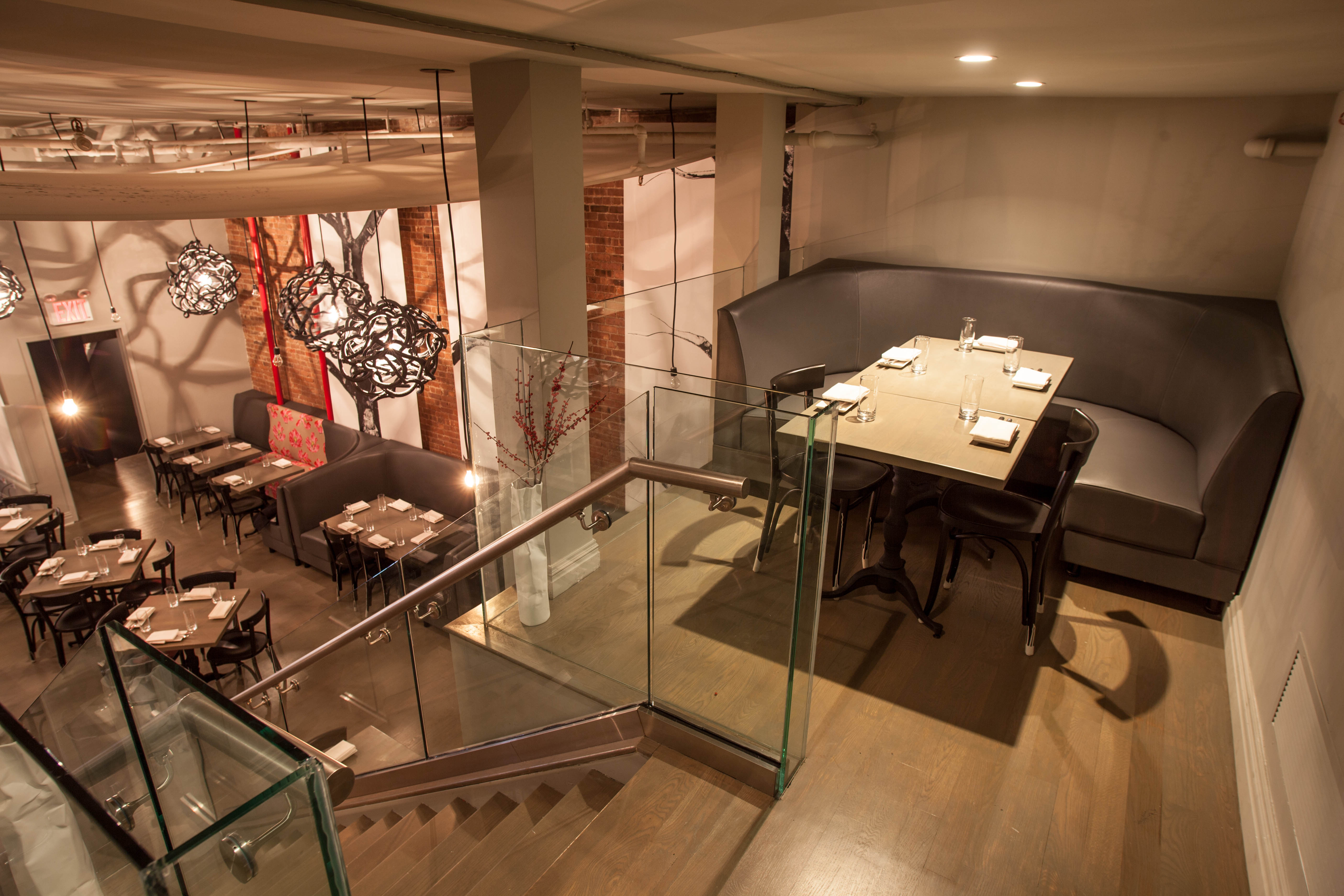 A perch amongst the trees, exemplified here in an upstairs dining nook.[/caption]
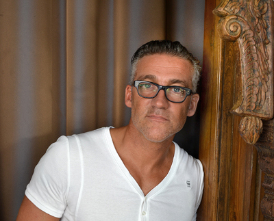
Thomas Schoos has designed four Morimoto restaurants.[/caption]

